Shapes Tell Stories
Circles feel soft and inclusive, squares suggest stability, and triangles

Sophia Mendes
Creative Director
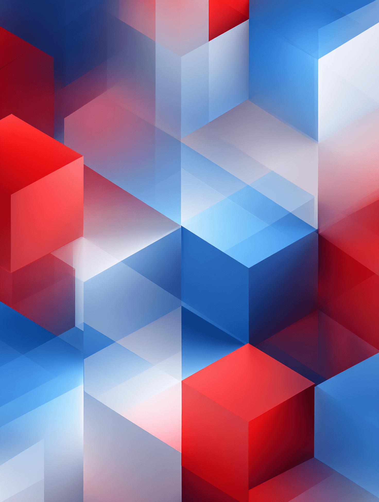
Every shape on a page is doing emotional work, whether the designer intended it or not. A circle invites. A square steadies. A triangle pushes. Long before anyone reads the copy or registers the color, the geometry has already set the mood. Shape is one of the oldest visual languages humans have, and the brain still reads it instantly — which means every framing decision, every container, every icon is quietly shaping how the work feels.
Geometry Is a Language
Shapes carry meaning the way letterforms do, except faster. The eye doesn't have to decode them — it just feels them. A rounded button reads as friendly before the user thinks the word friendly. A hard-edged grid reads as serious before the brain reaches for the word serious. This isn't mysticism, it's pattern recognition built up over a lifetime of seeing soft things in soft places and rigid things in rigid ones. Designers don't invent these associations. They inherit them.
The job is to use them on purpose.
Circles, Squares, Triangles
Circles soften everything they touch. They suggest continuity, community, openness — no sharp ends, nowhere for the eye to catch. Brands that want to feel approachable lean on them constantly: rounded avatars, pill-shaped buttons, soft container corners. The risk is that overused circles start to feel generic, the visual equivalent of a smile that never drops.
Squares and rectangles ground the work. They suggest order, structure, reliability. Most layouts are built on them by default, which is exactly why they tend to disappear — the eye stops noticing them. That invisibility is useful. A square doesn't compete for attention; it holds the space so something else can.
Triangles do the opposite. They're directional, kinetic, slightly unstable. The eye can't help but follow where they point. Used sparingly, they create energy and movement. Used carelessly, they create tension nobody asked for. A triangle is a strong word — and like any strong word, it loses meaning if every sentence has one.
The System Underneath the System
Most brands have a typography system, a color system, a spacing system. Far fewer have a shape system — and it shows. Buttons with one corner radius, cards with another, icons with a third, photo crops with a fourth. The result feels almost right, which is somehow worse than feeling clearly wrong. Coherent shape language ties the whole brand together at a level users can't articulate but always feel.
Pick the radii. Pick the proportions. Pick the geometric vocabulary the brand will speak in. Then hold it everywhere.
Breaking the Shape Rule
The strongest shape moments usually come from controlled contradiction. A brand built almost entirely on circles puts a single sharp-edged element on the hero, and the eye locks onto it instantly. A grid of rectangles is broken by one diagonal, and suddenly the whole page has a center of gravity. These moments work because the system around them is consistent enough that the exception reads as intentional.
Without the rule, the break is just noise.
The Takeaway
Shapes aren't the surface of design. They're the substructure underneath the mood. Every container, every button, every icon is making a small emotional claim, and those claims add up. Get the shape language right and the brand feels coherent before anyone can explain why. Get it wrong and no amount of color or typography will quite fix it.
Choose the geometry like it's saying something. It is.
SHARE