The Power of White Space
Why less truly is more in modern design. White space isn’t empty — it’s breathing room for ideas. Brands that embrace it feel sharper, calmer, and more premium.

Sophia Mendes
Creative Director
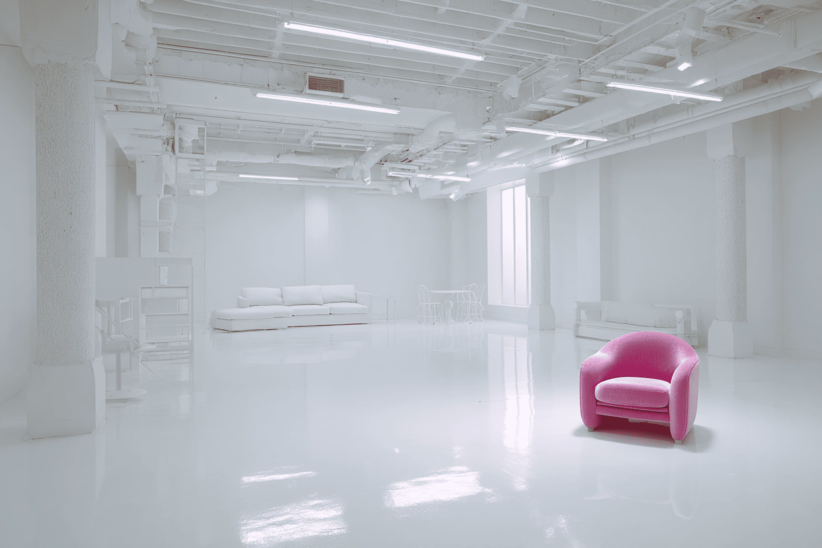
When most people think of design, they imagine colors, images, and typography. But one of the most powerful tools in any designer’s toolkit is what’s not there — white space.
In a world overflowing with information, brands that embrace white space feel sharper, calmer, and more premium. Instead of overwhelming people with clutter, white space creates focus.
It guides the eye naturally, letting the most important elements — your message, your product, your story — stand out.
White space isn’t empty; it’s purposeful. It can make a bold logo look iconic, elevate a headline, or transform a simple layout into something that feels timeless. Apple has built an entire brand identity around this principle, but the idea works for startups, creatives, and businesses of every size.
White Space Is Not Empty Space
White space often gets misunderstood. Clients sometimes fear that “empty” design looks unfinished or wastes valuable space. But in reality, white space is active — it frames content, enhances usability, and creates rhythm.
Think of it like music: the pauses between notes matter as much as the notes themselves. Without pauses, everything blurs into noise. In design, white space creates those pauses, giving your audience time to absorb and engage with what they see.
The Psychology of Breathing Room
Design isn’t just visual — it’s psychological. Research shows that white space improves comprehension by up to 20%. That’s because our brains crave organization. When layouts are packed with competing elements, users feel stressed and disengage. But when there’s room to breathe, people naturally relax, focus, and trust the message.
This is why luxury brands use spacious layouts. The empty space says, “We don’t need to fill every inch — our product speaks for itself.”

Why White Space Works
White space draws the eye to what matters most — whether that’s a headline, a call-to-action, or a product image.
It reduces visual clutter, making designs easier to scan and more comfortable to engage with.
Minimal, spacious layouts often feel more premium and trustworthy, giving your brand a stronger presence.
Proper spacing between text blocks makes content more approachable and user-friendly.
Negative space provides structure, making the composition feel intentional and harmonious.
How We Use White Space at Flow
At Flow, we use white space as a design strategy, not an afterthought. It’s about restraint — knowing when to stop adding so the essentials can shine. Every project, from branding to web design, uses white space to create balance, focus, and impact.
We design experiences that move with intention. And often, the most powerful move is stepping back.
Less Says More
White space isn’t about emptiness — it’s about meaning. It allows your brand to communicate with confidence and simplicity. By embracing it, you not only design something beautiful, but something that feels alive and purposeful.
Great design isn’t just what you put in. It’s also what you leave out.
SHARE